Context
This project explores a conceptual visual system for CoreCMS — a headless content platform. The work is based on a real product context and focuses on improving consistency, clarity, and scalability of the visual language across digital touchpoints.
Before
Basically, the existing visual language showed inconsistencies in color, typography, spacing and the lack of key visual system, resulting in weak hierarchy and reduced clarity.
Goals
- Build on existing brand equity through minimal, high-impact changes
- Establish a consistent and controlled visual language
- Improve visual clarity and hierarchy across interfaces
- Build a scalable and modular visual system
- Enable faster and more reliable web design decisions
- Establish a consistent and controlled visual language
- Improve visual clarity and hierarchy across interfaces
- Build a scalable and modular visual system
- Enable faster and more reliable web design decisions
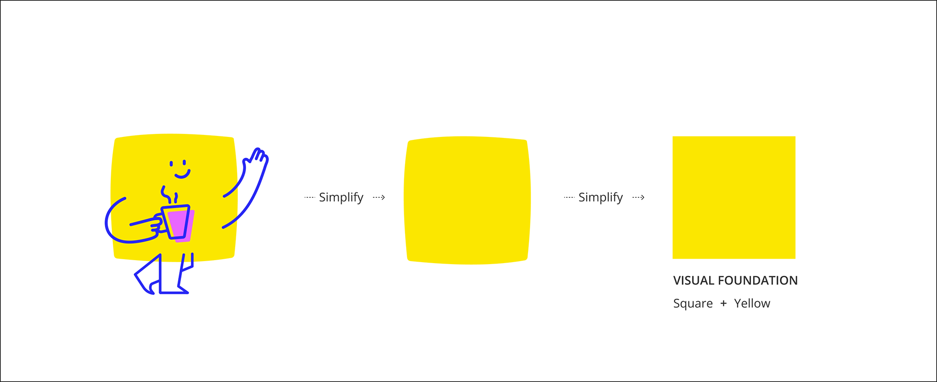
Step 1 / Define the visual foundation
The existing brand relied on illustrative elements, including a mascot-like character primarily used in event contexts. The concept evolves the existing mascot into a more structured and abstract visual language, improving clarity and enabling scalability.
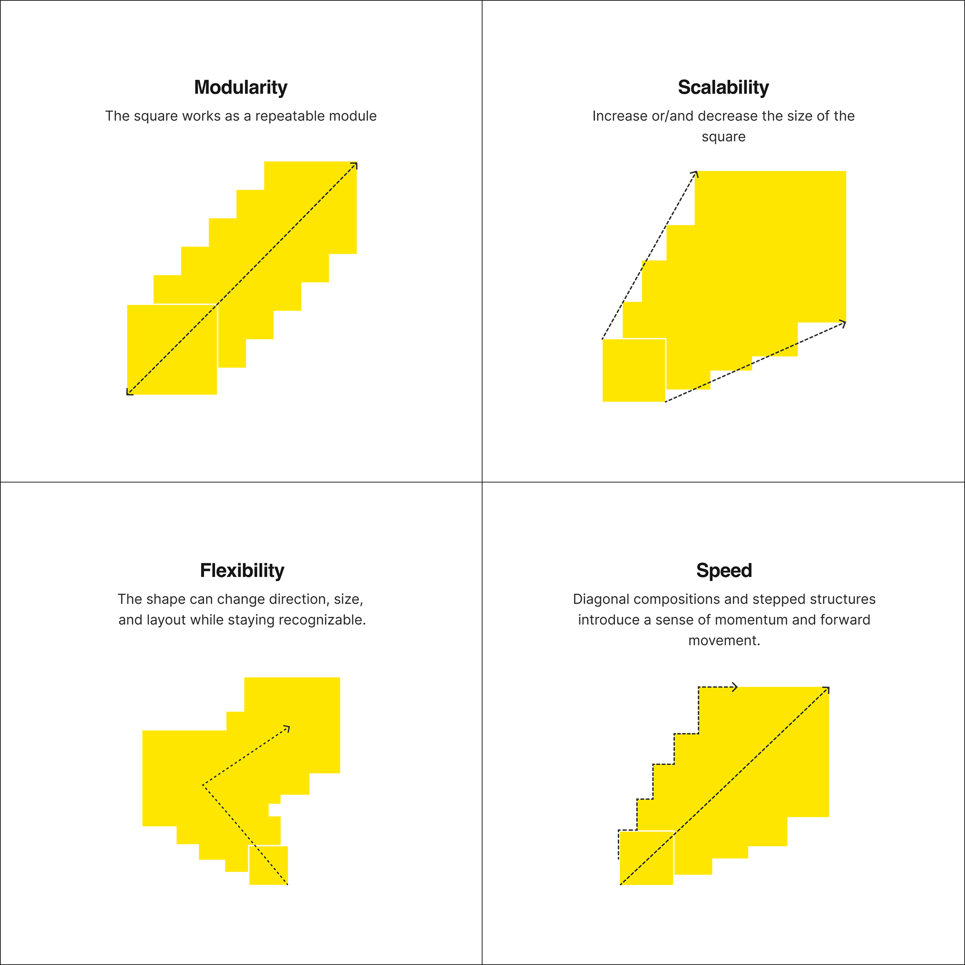
Step 2 / Turn foundation into a system based on brand principles
The visual language was designed around four key principles reflecting the brand.
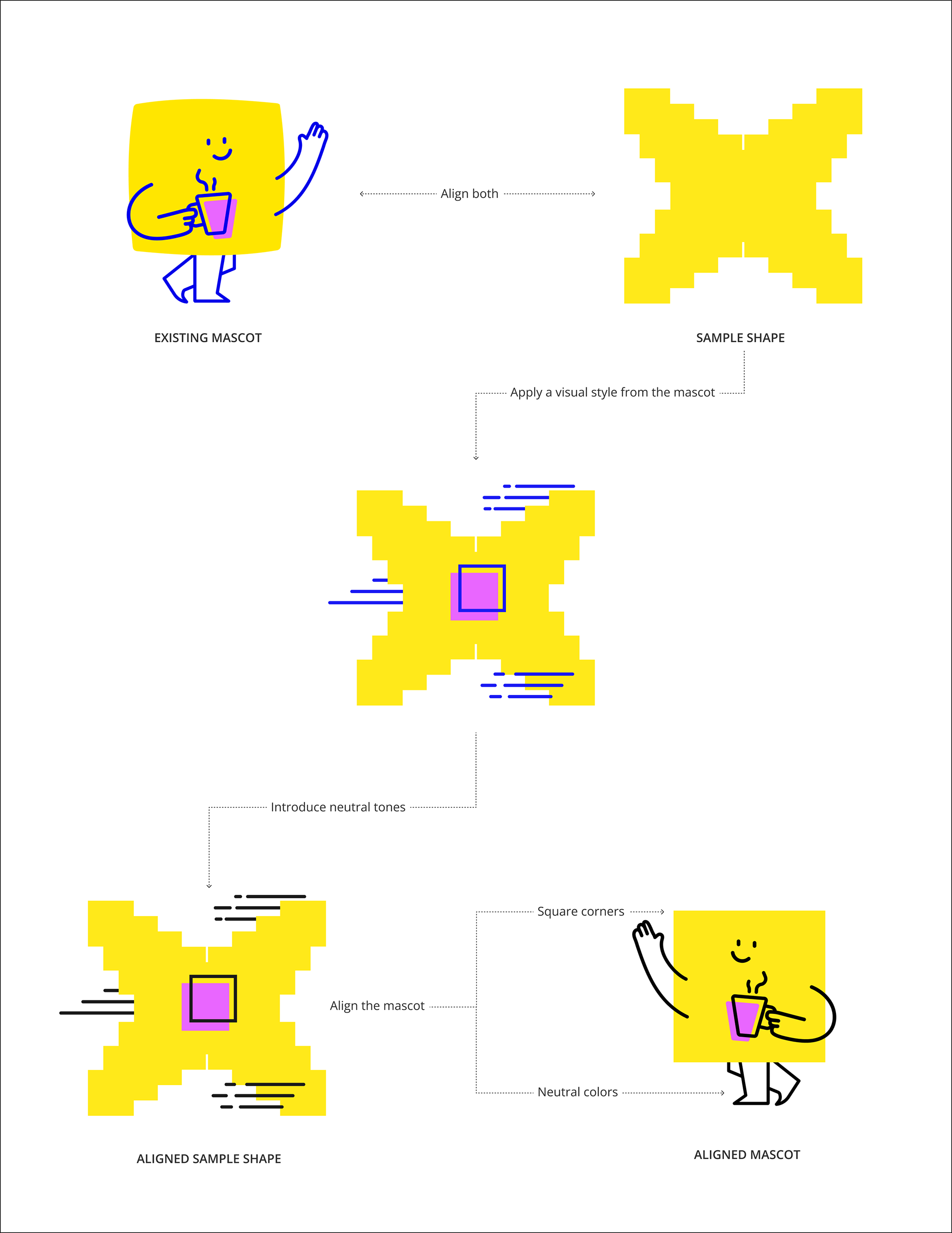
Step 3 / From expression to usability
The visual system was aligned with the existing mascot by translating its stylistic language into a more structured form. At the same time, both were refined through the use of neutral tones and simplified elements, balancing brand expression with usability and interface performance.
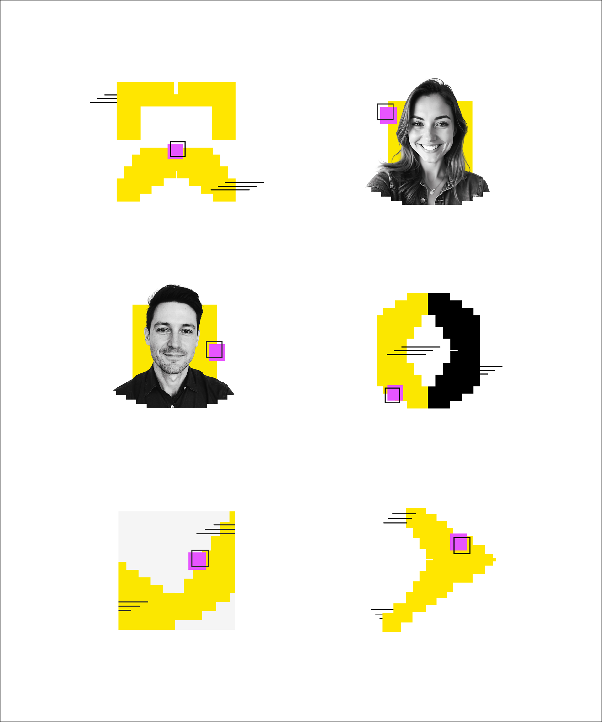
Step 4 / Expand across use cases
The system expands from simple shapes into flexible compositions, combining modular elements, motion, and real imagery to adapt across different contexts while staying visually consistent.
Step 5 - Bringing the system to life
The system scales across digital, print, and environmental touchpoints, maintaining consistency while adapting to different formats and contexts.
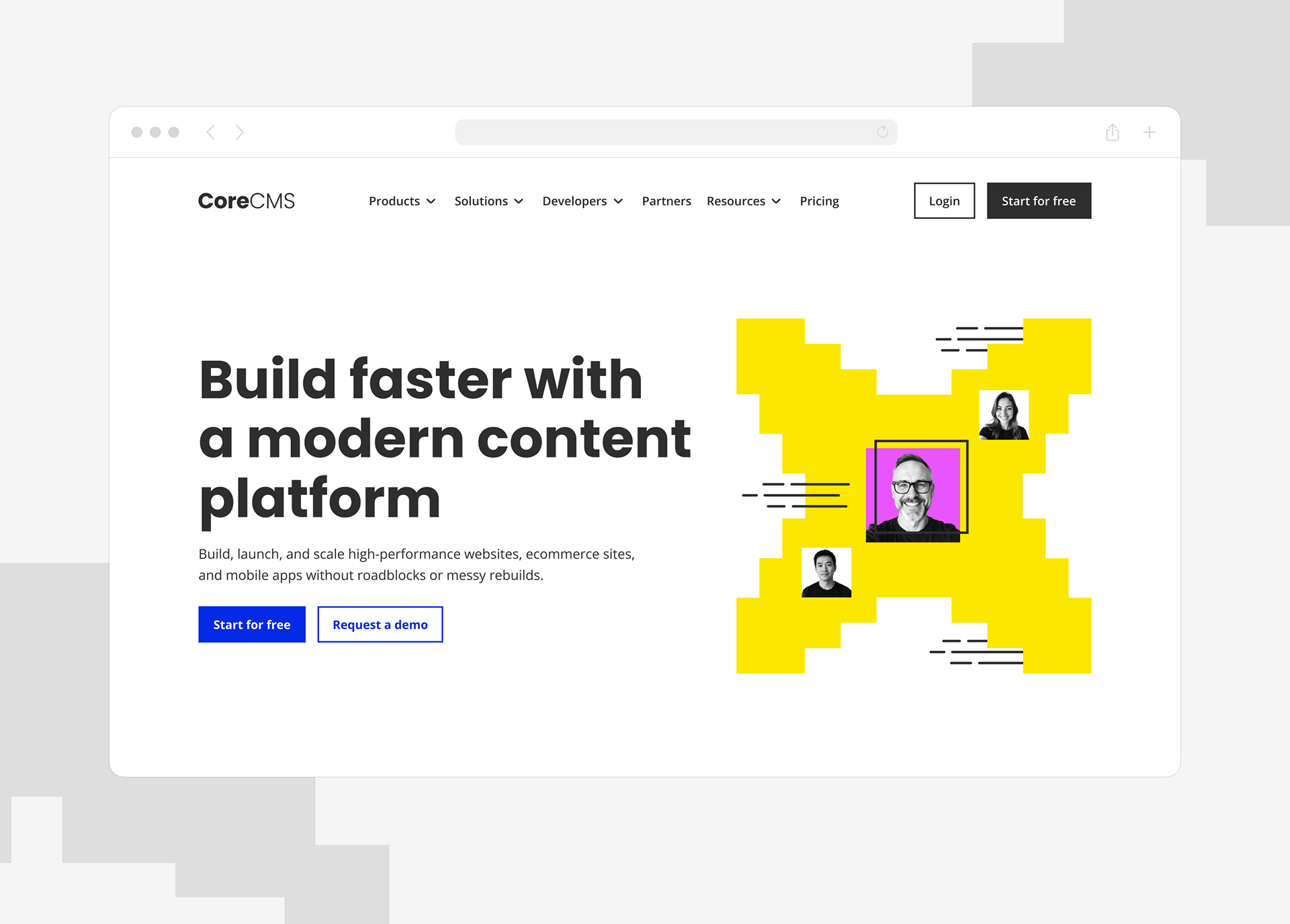
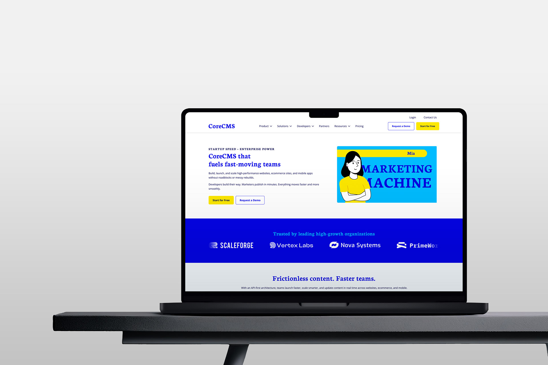
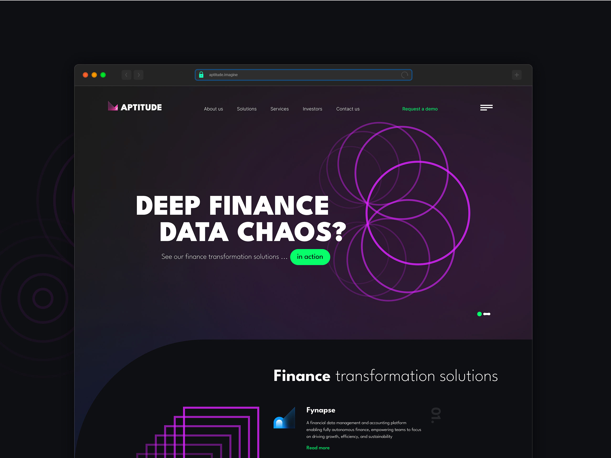
Step 5.1 - Web design
The website was designed to deliver a modern, flexible, and visually consistent experience across key marketing touchpoints.
Modular design system
The interface was built using reusable components, variables, and scalable design patterns to ensure consistency across marketing pages and digital assets.
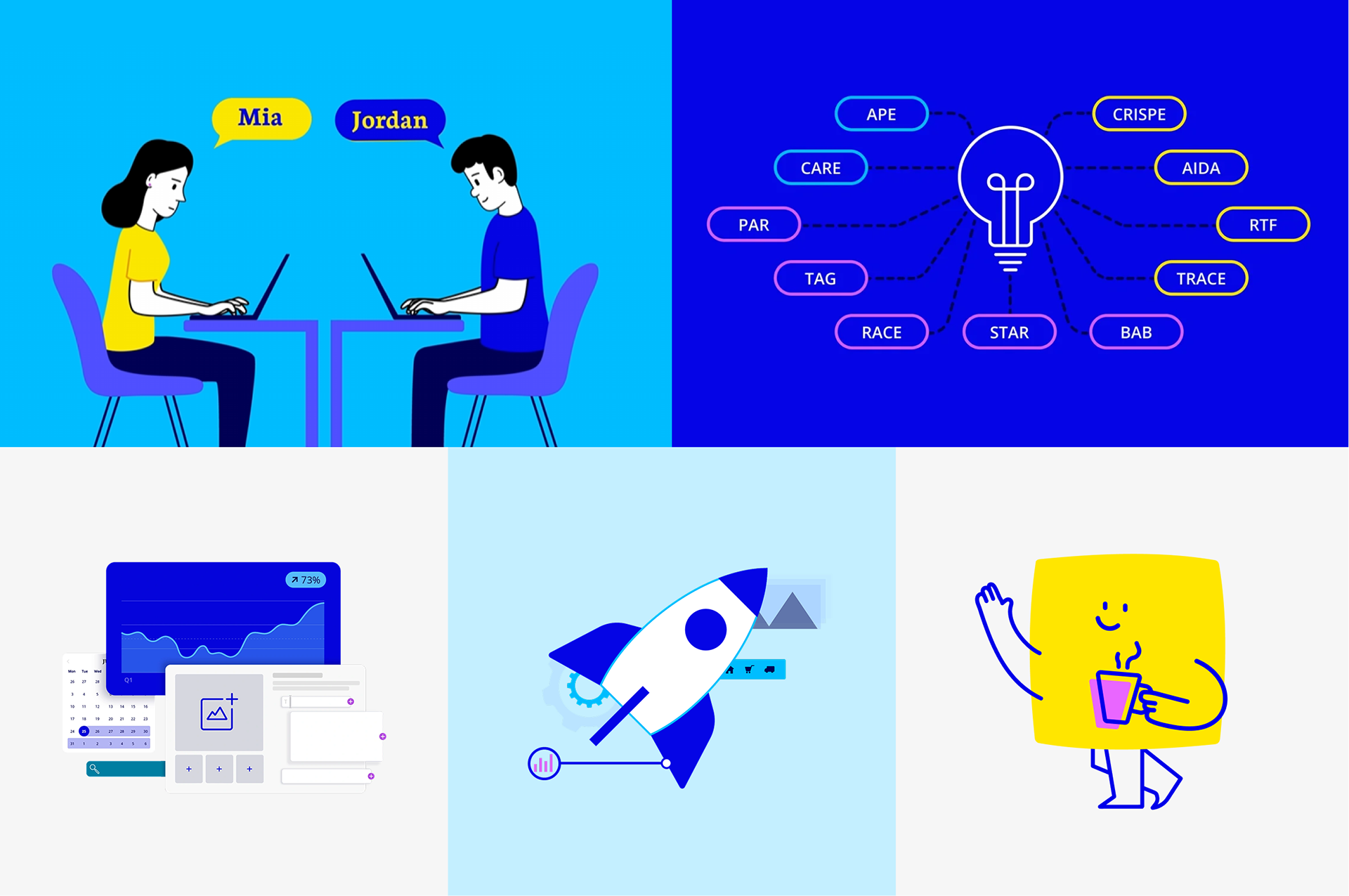
Step 5.2 - Social media
Social media assets were adapted to compete in high-attention digital environments using stronger colors, bold typography, and more dynamic compositions while staying aligned with the CoreCMS brand system.
Step 5.3 - Print
The visual system was extended into print materials while maintaining consistency across typography, composition, and brand elements.
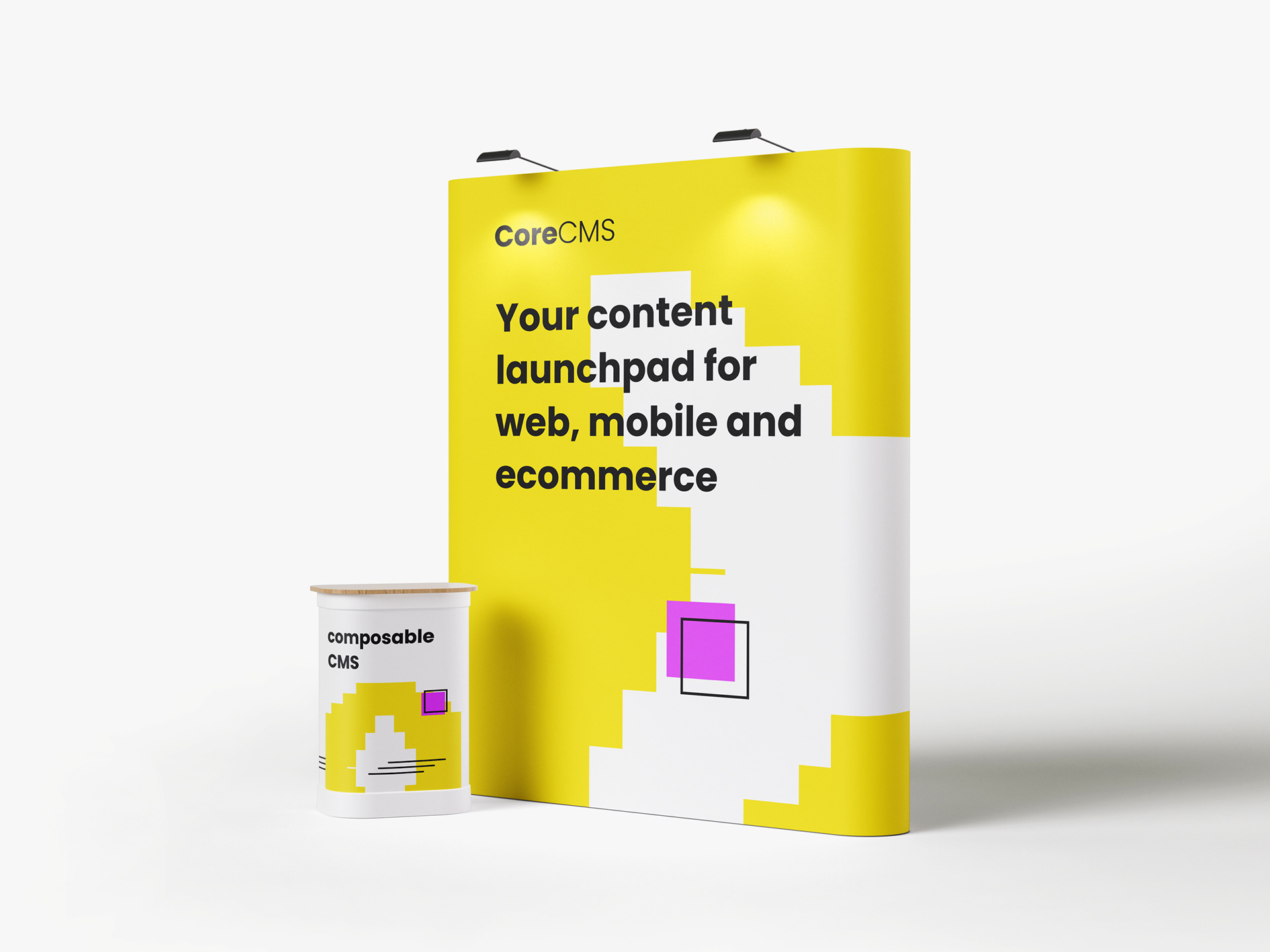
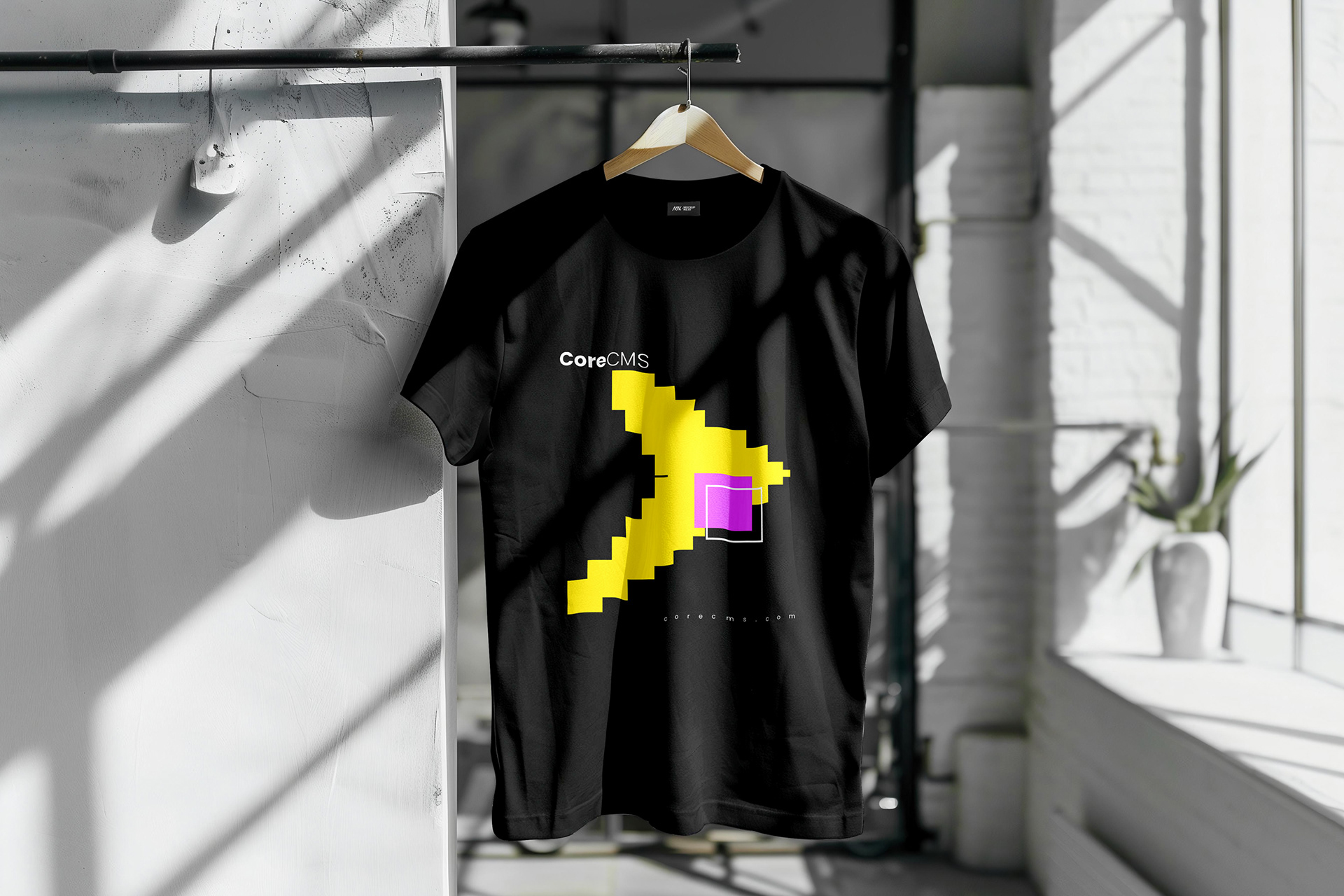
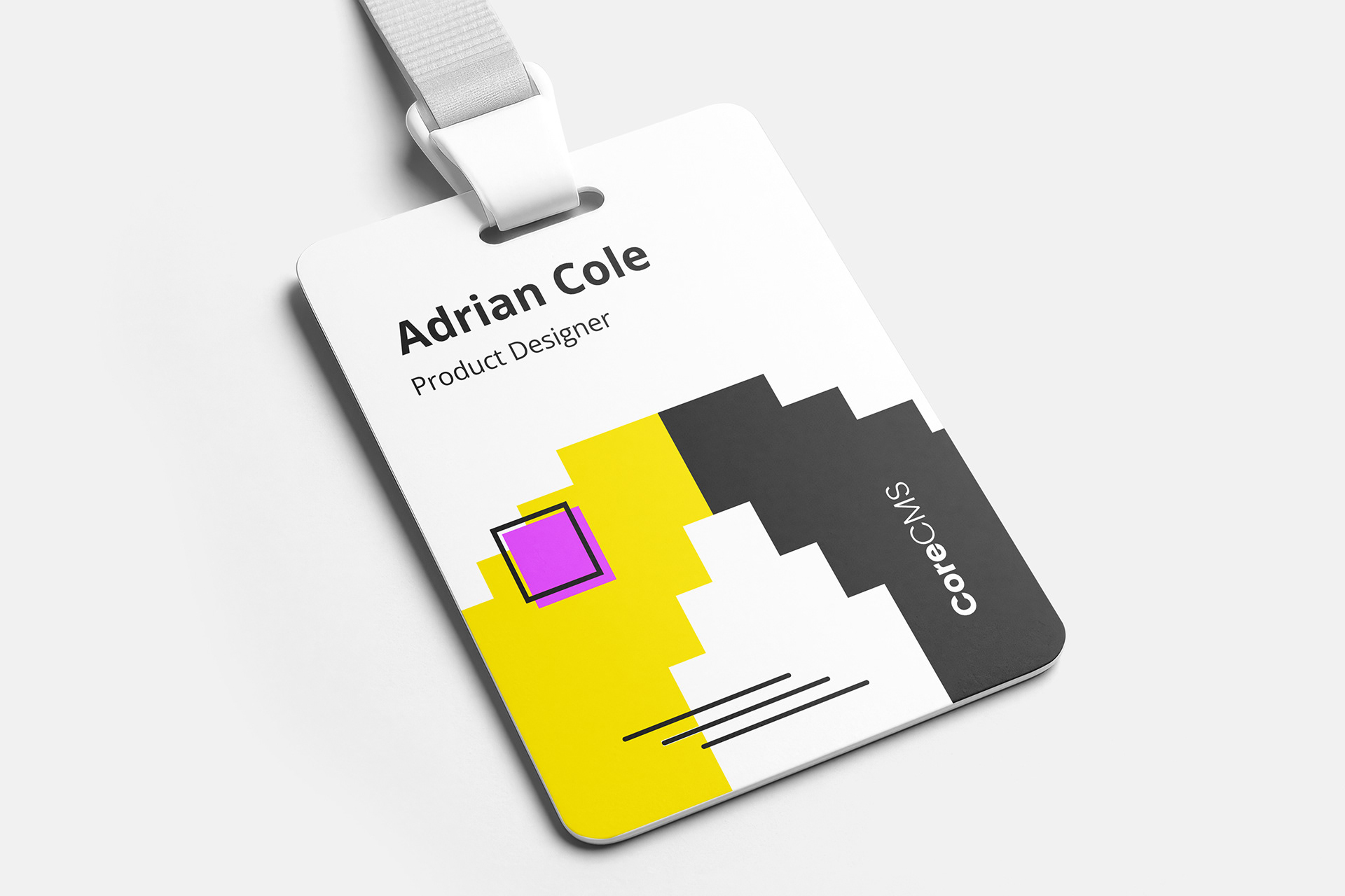
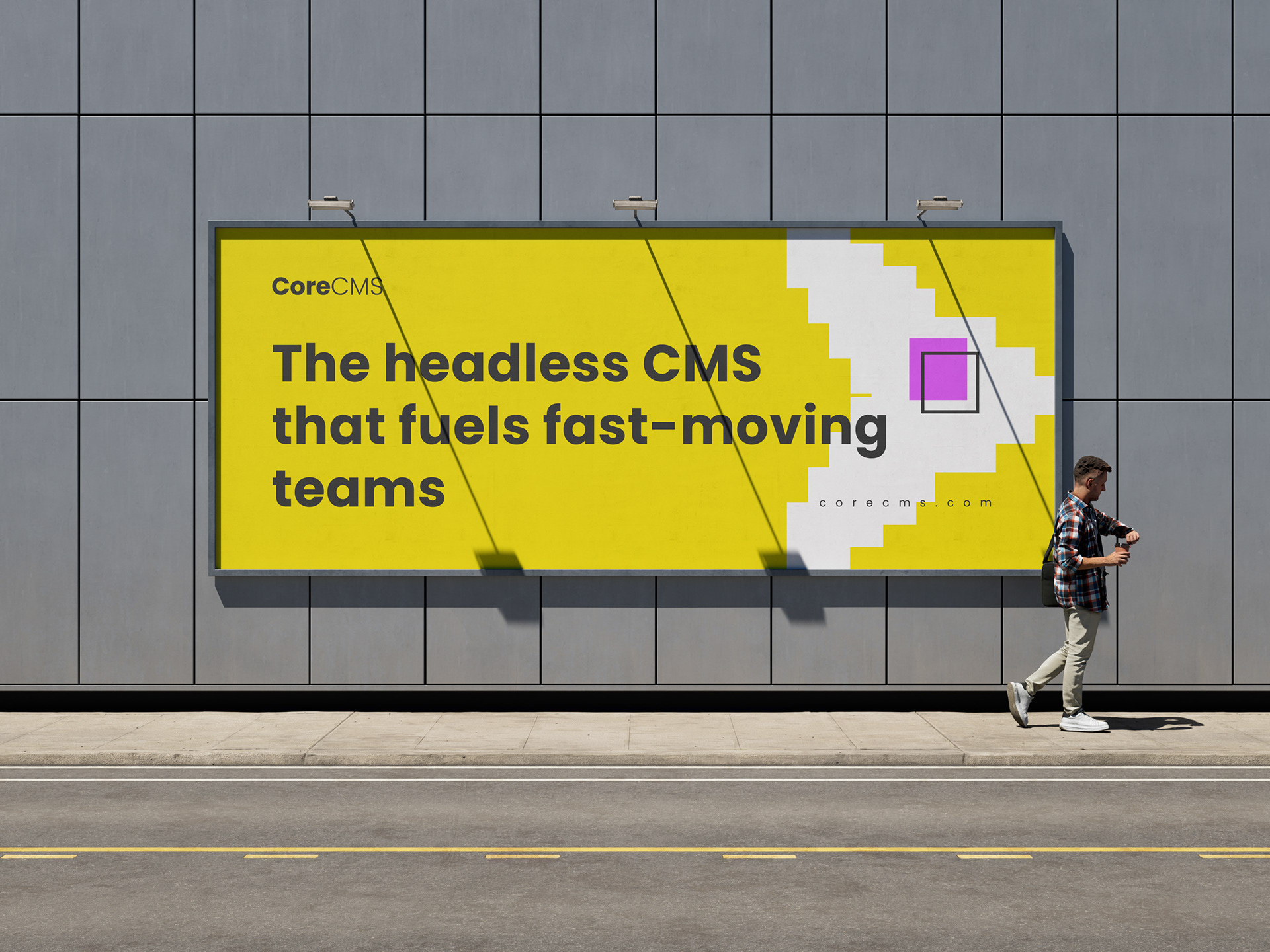
Step 5.4 - Brand Applications
The identity system was designed to adapt seamlessly across large-scale environments, event materials, and branded applications.


