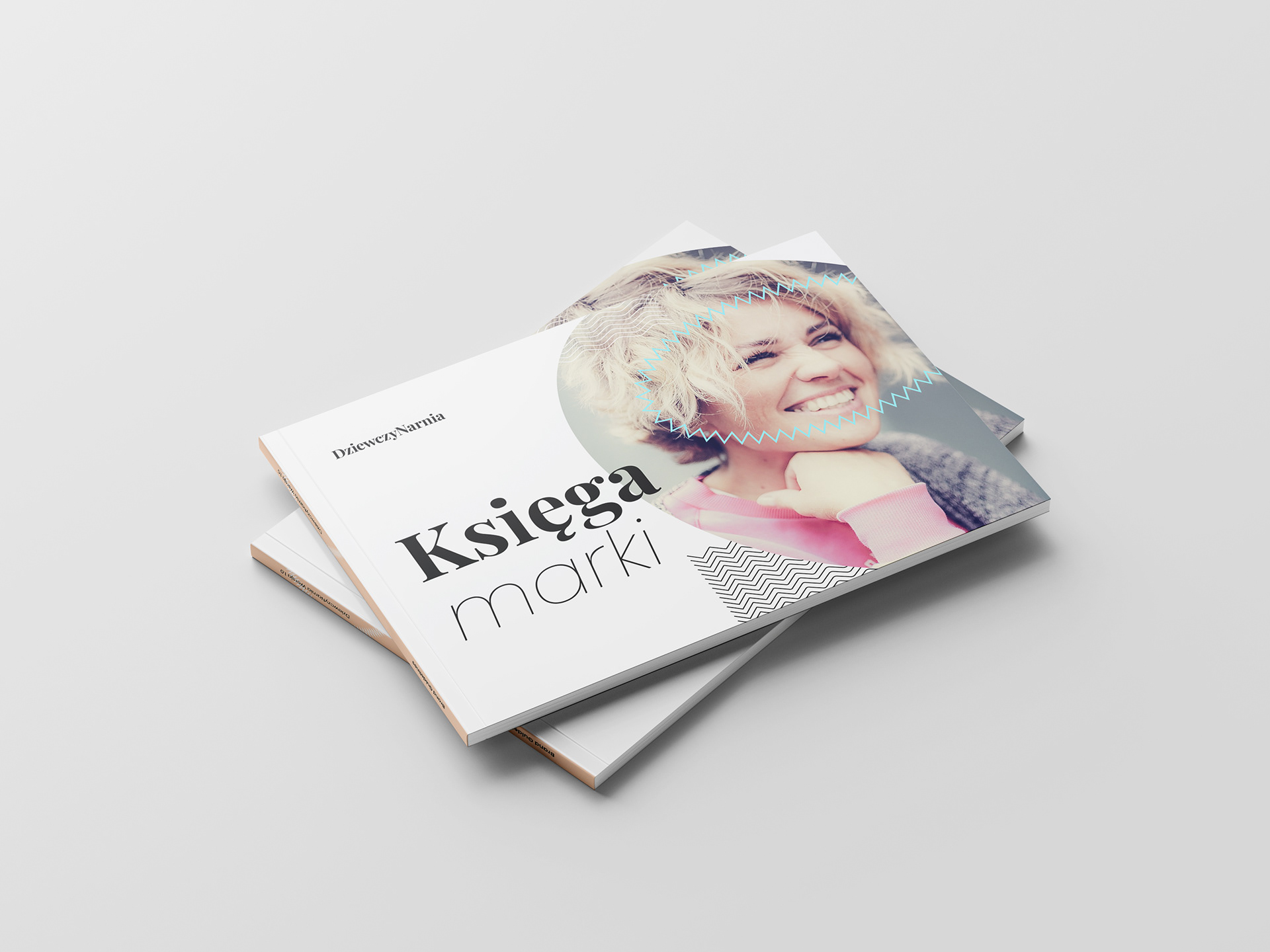
While designing the visual identity system for DziewczyNarnia, creating a meaningful brand book was a natural part of the process.
Here, I’m sharing a selection of pages from the full 60-page document.
Below, you can see a few pages presenting the logo in the logotype version.

Alongside the logotype, a distinctive logomark was also crafted and thoughtfully described to highlight its role within the brand’s identity.

The brand’s typography combines two distinctive typefaces — Playfair Display and Poppins — reflecting both the expressive, creative spirit and the sense of warmth and connection at the heart of DziewczyNarnia.

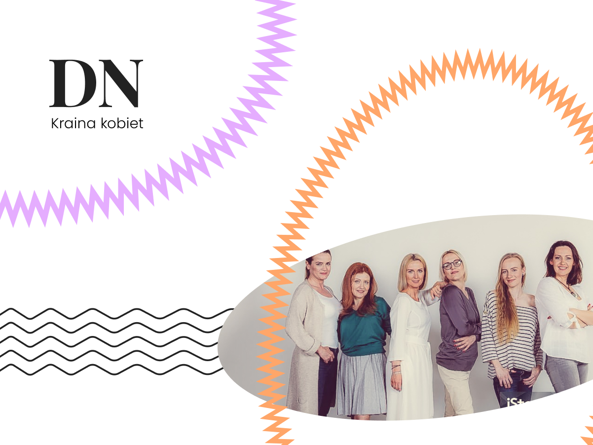
Specific shapes form the backbone of the brand system and key visuals. Clear guidelines for their use provide structure and consistency, while still leaving room for flexibility and creative expression.
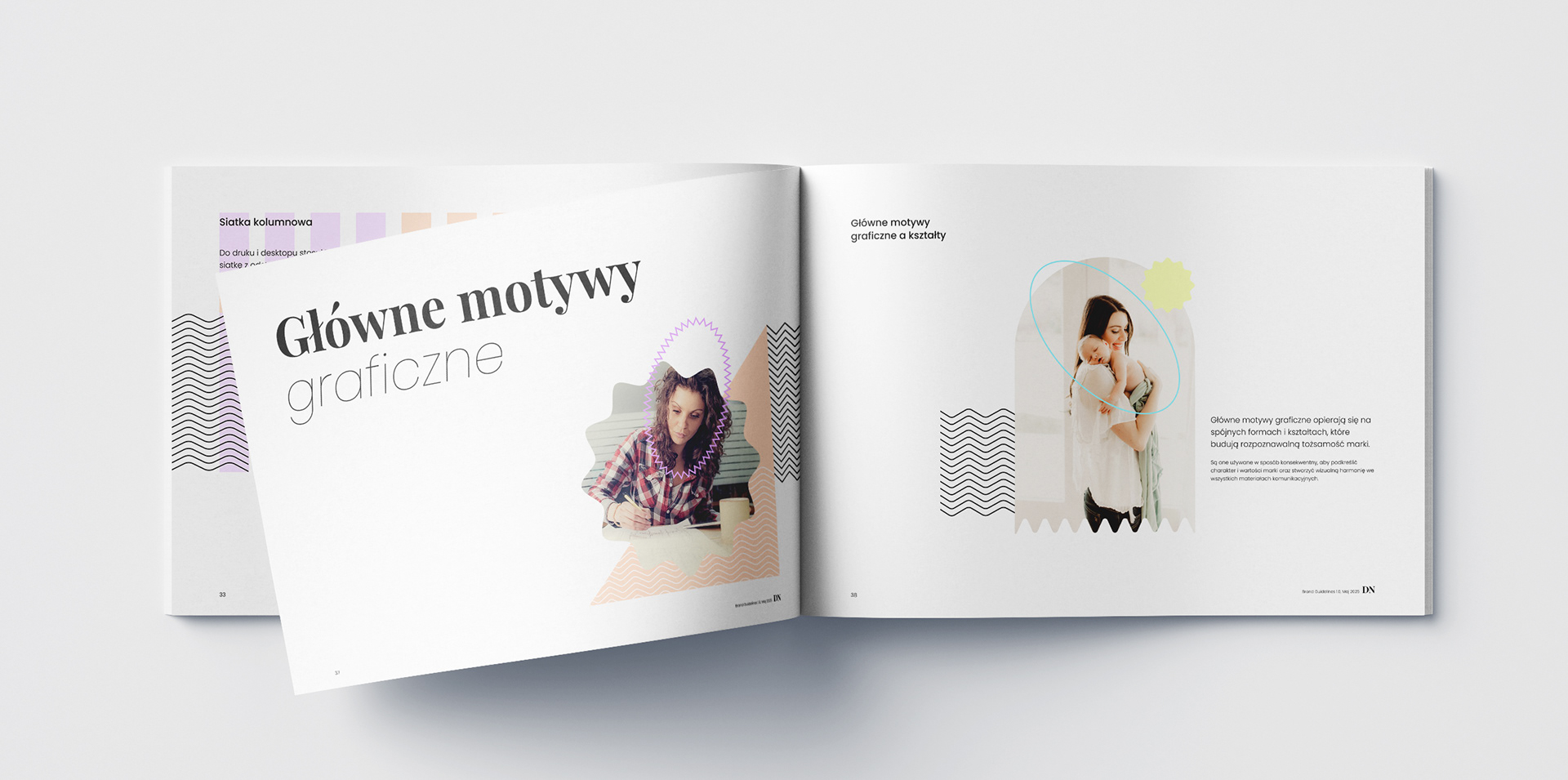
Photography plays a central role in the key visuals, acting as the soul of the brand. By combining environmental, lifestyle, and intimate portraits, I aimed to capture genuine moments and convey a deep sense of authenticity.